The form field types
Intro
When you create a form with the form editor, you can add fields. The fields form the basis for the form and determine what the end user can or should fill in.
Based on the field types, graphs can be created and workflows can be configured.
You can add fields to your form by dragging the field types from the left column to the middle column. As soon as you do this, you will be asked what the title of your new field is and once you enter it, the new field will be created. You will see it appear directly in the preview on the right.
But which field type, with which properties is most convenient in which situation? We try to answer that question in this article.
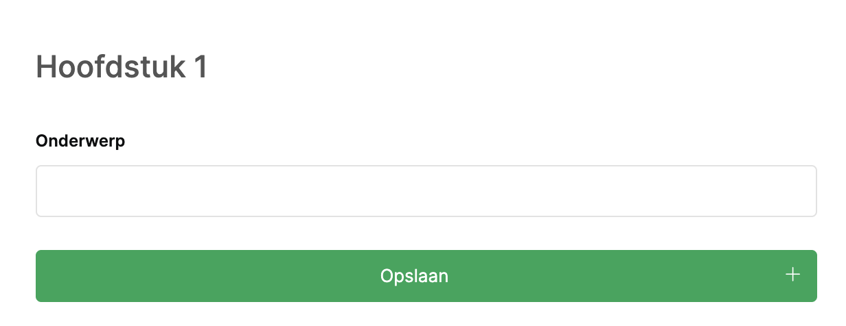
1: The title field
The title field is a field used in standing forms to create titles or headings between fields:
Title:
Warning notification:
Text

2: The label field
The label field is there to show certain conclusions to the user. This can be useful in a questionnaire form in which you draw interim conclusions that you want to share with the user. You can (of course) determine the color and text of the label yourself.
Conditions:The form is a standing form
3: The link field
The link field can be used in any form type and contains a fixed link to a web address that opens (by default) in a new tab.
This can be useful if you want to conduct people to other locations.
4: The text input area
The text area can be used in each form and ensures that your used text can fill in. However, this area can be used in 5 ways. Under the value settings of the field, you can determine whether this area:
Standard text
A number field
A date field
An index field
This way you can have unique codes/numbers generated. This field type is also often used for More complex unique codes.
A link field
Configuration:
5: The multi-line text input field
The multi-line text input field is a text field that covers multiple rows. This field type is ideal for when users want to release a lot of text as with an explanation.
Standard text input
Text input with layout
6: The field of choice
The selection field is a field in which users can choose from a number of options. This can be one option, but if you make the field multiple options, it can also be multiple options.How these options end up in the field can be configured in 3 ways.
1: Fixed options
An Fixed list. You can add fixed options by going to the value settings of the field. A user can then choose from this. This can be useful if it concerns fixed options that are only needed within this form.
Configuration:
2: Dynamic list
3: Reference list
7: The checkbox field
1: Fixed options
An Fixed list. You can add fixed options by going to the value settings of the field. A user can then choose from this. This can be useful if it concerns fixed options that are only needed within this form.
2: Dynamic list
3: Reference list
8: The list field
Standard List
Logbook list
9: The file upload field
A standard file upload
With a file upload field, you can let users upload files and attach them to registration. This can be some but also multiple photos/files.
Photo uploader
On mobile, users can take a photo instantly, making it even easier to make registrations.
You can also have the user draw about the photo if you wish.
More information about this type field type can be found in this article:The file upload field
10: The video field
With a video field you can add Youtube or Vimeo videos to your forms. This is ideal for making quizen to inform or test employees.
11: The status field
Default status
Status buttons
With Status change notifications It is also possible to have these fields automatically get the right color. This means that you always have a good overview.
12: The location field
With a location field, you can let the users save a location. The user can do this by manually dragging, but also by sharing its current location.
13: The signatures field
The signatures field allows you to have users sign. This allows you to always prove that it was signed for approval during registration.
14: The integrated form field
An integrated form field allows you to create registrations under existing registrations. This is often used for measures and/or tasks. How to do this is best to readHere.
15: The empty space field
The empty space field is mainly there for standing forms with multiple columns. This allows you to determine the position of titles and fields within your form.
End
These are the form types you can use. All these fields have plenty of features that you can use and are readily available on mobile. In addition, you can assign advanced triggers to these fields andHide fields.
Related Articles
The 3 form types
The 3 types of forms You can create a new form in the form editor by clicking the "New +" button. As soon as you do this, a new form will be created immediately after which you can change this form. You can do this by dragging the form elements to ...Create a basic configuration form
Intro You can use the editor to create as many forms as you want. These forms can also work together, creating a system. In addition, you canHide fieldsIn all kinds of circumstances. What only is missing in this modular setting is a configuration ...Creating forms
In order for your ISMS or KMS to function properly, you need forms. For example, to report complaints, to be able to make supplier reviews or to be able to participate in inspection rounds. Therefore, you can use the forms editor to create as many ...The file upload field
With a file upload field, you can have a user upload files into your registration. This can be a single file but can also be multiple files. These can be photos, documents, presentations, videos or Excel sheets and can also be uploaded directly from ...Forms help forms
When you create a form, it may not immediately clear to everyone what you mean by the questions. Or what the form is intended at all. It therefore makes sense to help users on their way with different techniques. In this article we explain what you ...